THE BRIEF / CONTEXT
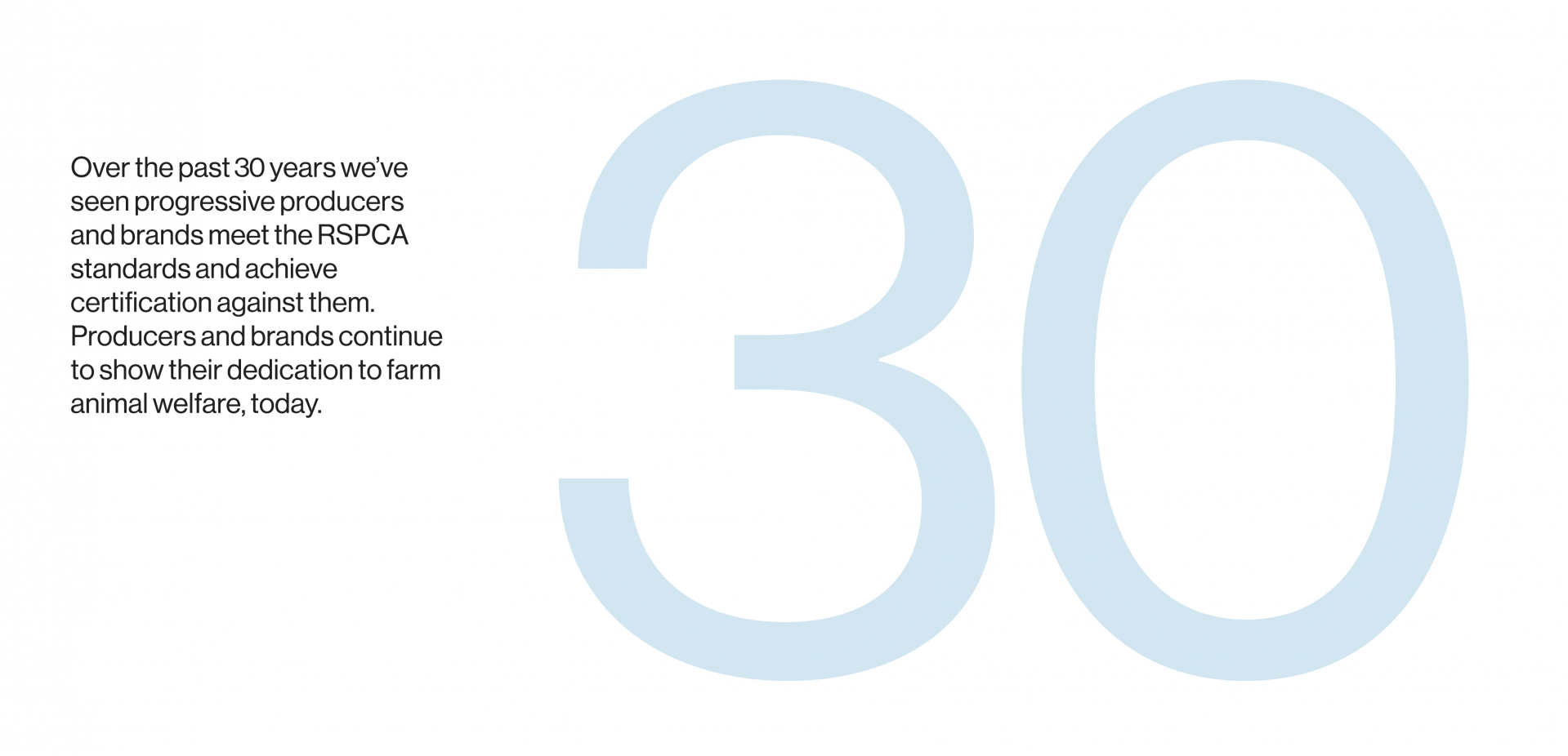
RSPCA Australia’s long-standing farm animal welfare program needed to evolve. Formerly known as RSPCA Approved, the name no longer reflected the rigour, independence and ongoing improvement at the heart of the certification. In a category crowded with vague claims and confusing cues, the program required a clearer role. One that reinforced its authority, improved recognition and helped Australians make confident choices.
THE INSIGHT
In a category crowded with vague claims and feel-good farming language, trust is fragile and decisions are made in seconds. Certification marks don’t just compete on credibility, they compete for visibility.
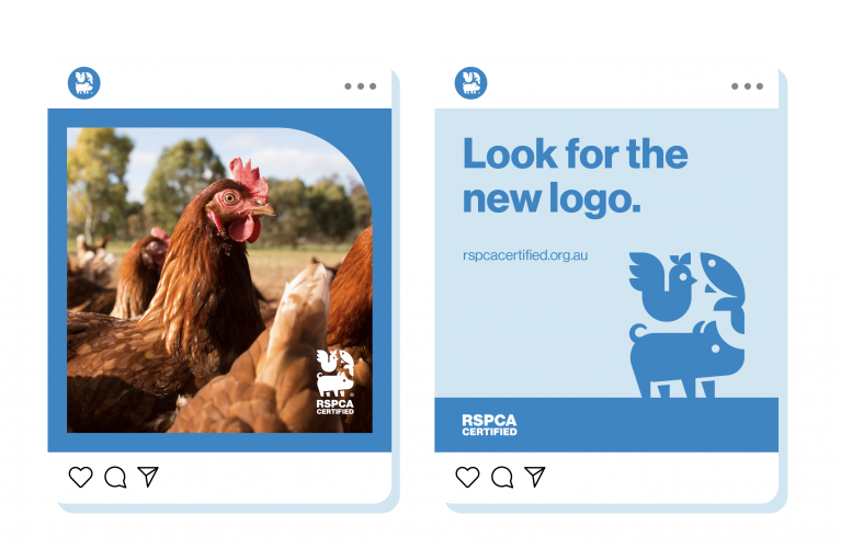
The move to ‘Certified' clarified the program’s authority, our insight was we needed to transform it from a compliance cue into a distinctive signal of higher-welfare farming.
THE SOLUTION
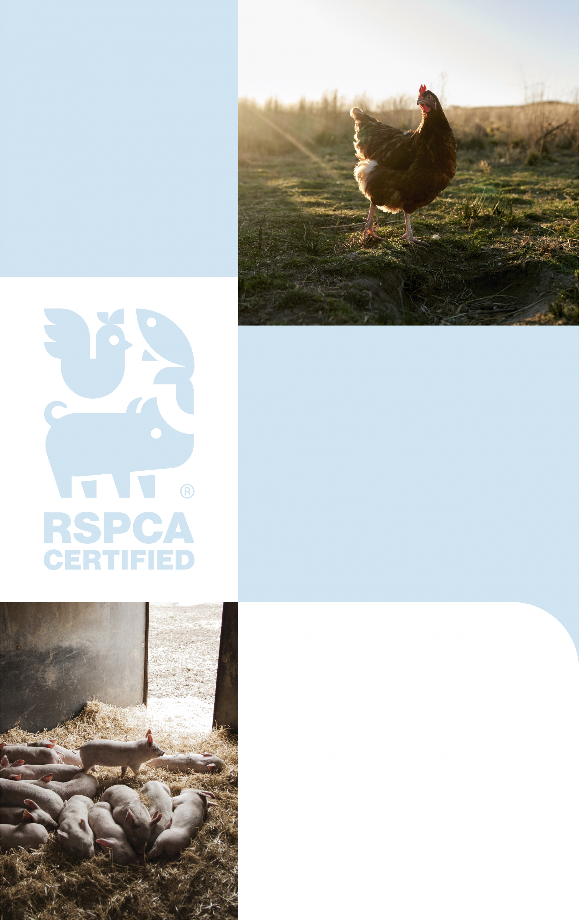
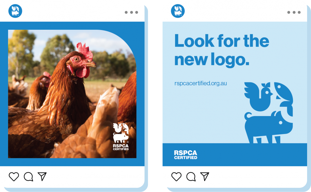
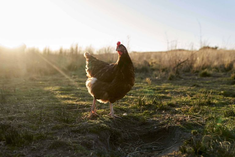
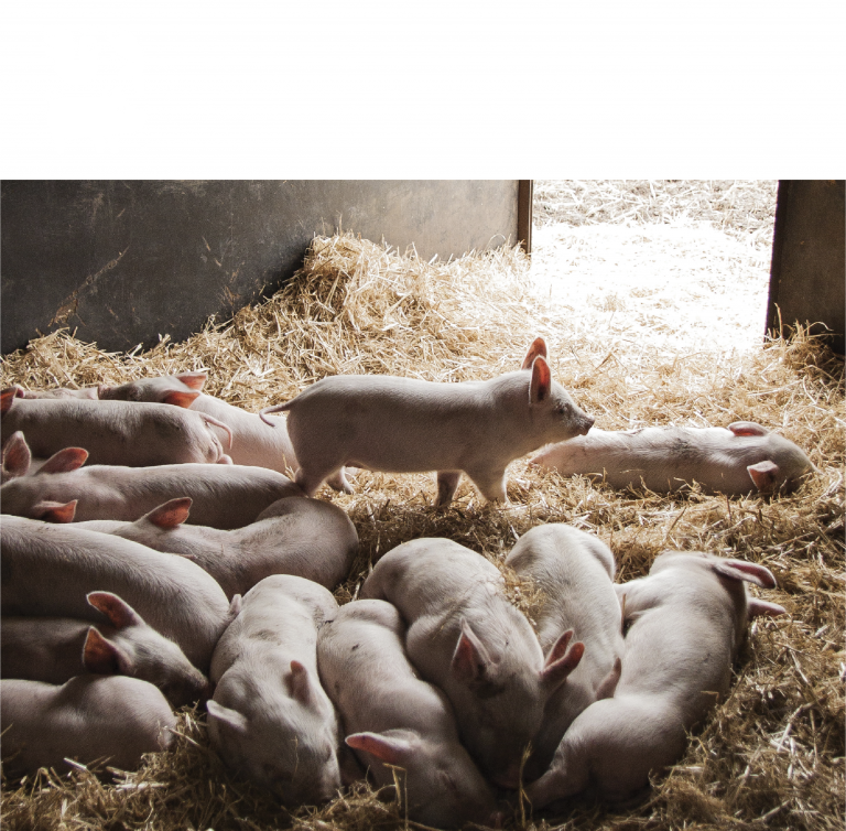
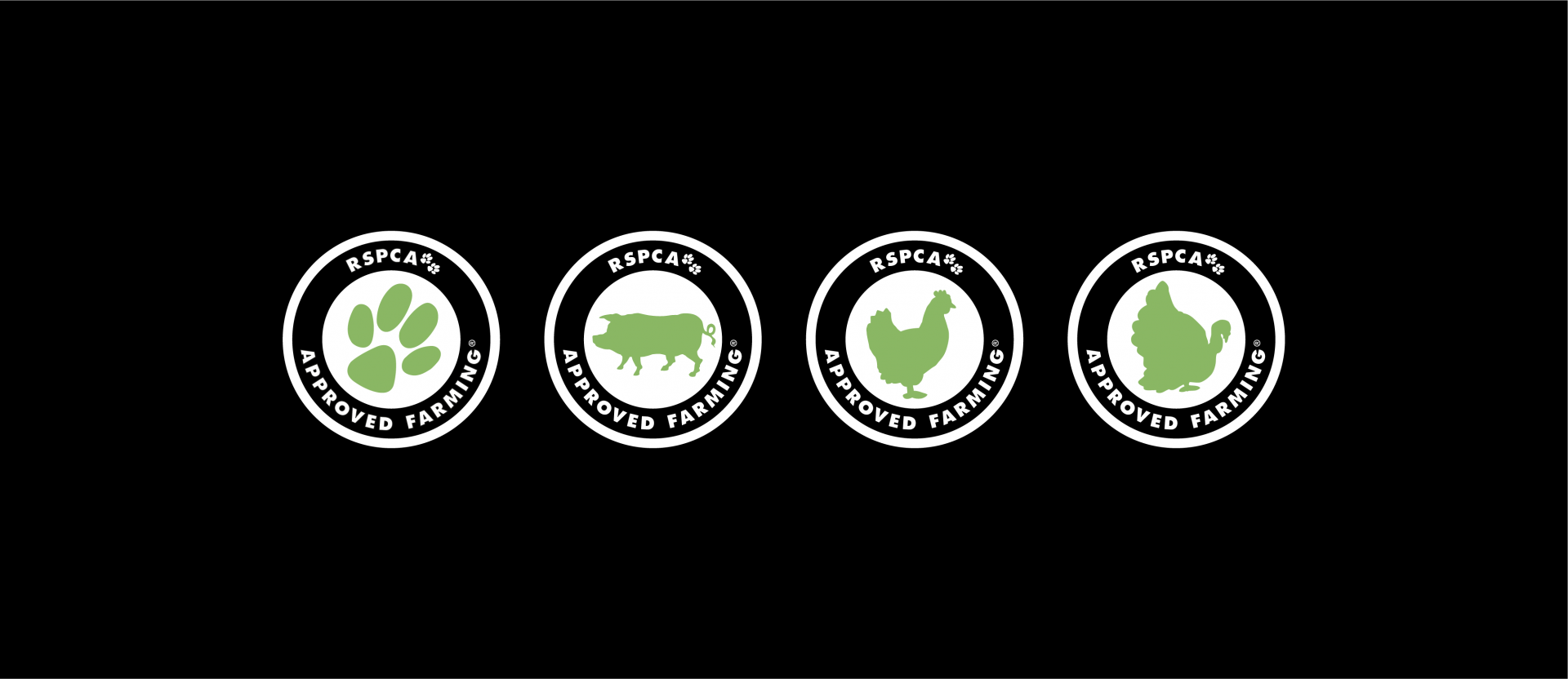
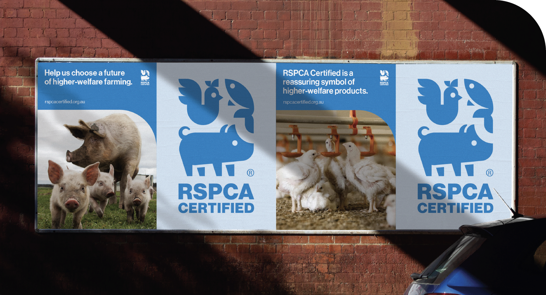
In partnership with Nature, we brought RSPCA Certified to life through a simple, powerful brand identity designed to signal progress and codify higher welfare.
We built a distinctive brand system to turn certification into a recognisable asset. A unified symbol representing all animals within the program. A strengthened use of the iconic RSPCA blue to create immediate cut-through and distinction amongst other claims.
The result is more than a new mark. A flexible suite of on-pack and off-pack distinct brand assets designed for consistency, scale and memorability.
It’s a clearer signal of rigour and independence, transforming certification into an instantly recognisable cue for higher welfare.