
Refresh and redesign Australia’s much loved Soothers brand and pave the way for a seamless move into the everyday wellness space. Make it look modern. Feel relevant. And grow the consumer base.
Sometimes the strongest voices are the most softly spoken. For Soothers, that meant a brand made up of gentle details offers the best opportunity to have the biggest impact.


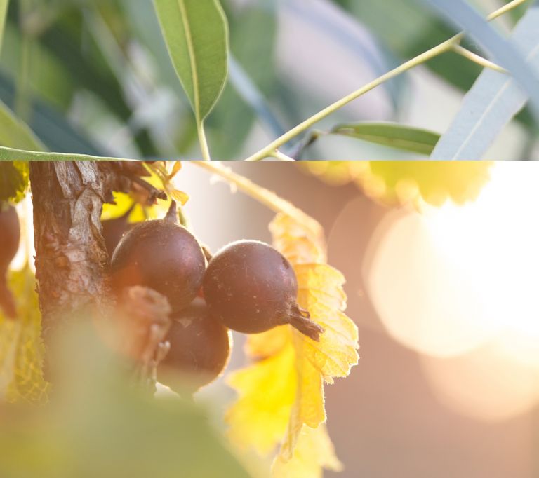
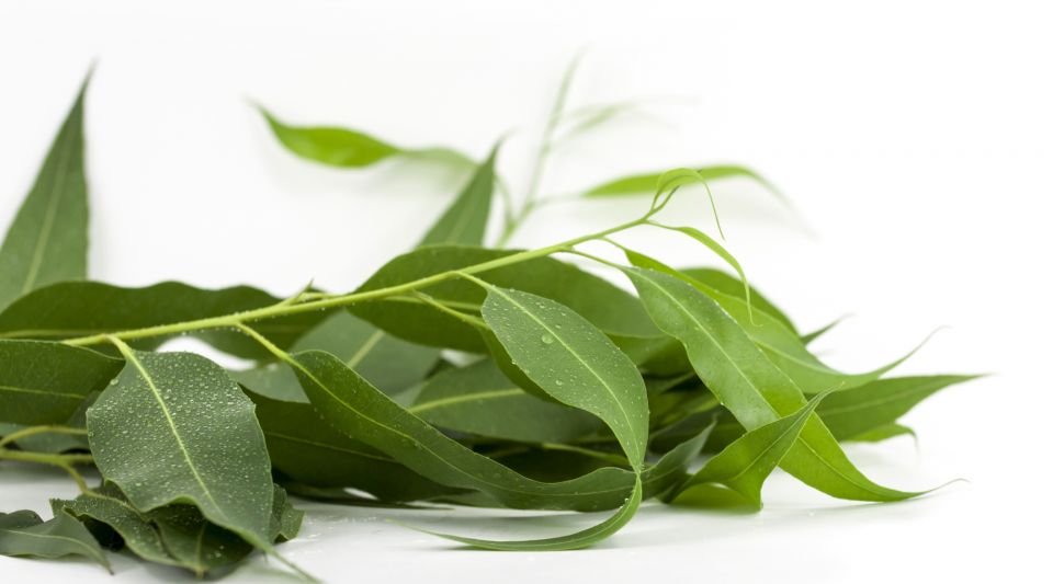
From our insight, the creative territory ‘A drop of goodness’ was born. The idea that a touch of nature’s healing powers can do wonders for your wellness.
This idea was infused across the entire brand architecture and design system we created. One that balanced efficacy and deliciousness in perfect equilibrium. Making the new products feel distinctly Soothers in the everyday wellness space.
We adapted the logo by stripping it back to its essential ingredients and reinforcing the most meaningful attributes. We made it feel lighter. Simpler. Softer. With curved letters that capture the brand essence and echo the sensation of a soothing lozenge.


We elevated the lozenge to create a sense of being uplifted. We created beautiful watercolour illustrations to heighten flavour and wellness perceptions. And crafted a sensation of lightness with solar flares echoing across the aesthetic. All designed to bring nature’s healing powers to life.


feels like
Working with the thrillsTM, we went on a strategic journey to unlock rich insights. Insights that ultimately helped us make the brand’s transition totally seamless.
Shmonie Darmo,
Senior Brand Manager, Medicated, Nestle
WHAT WE DID:
- Brand architecture
- Packaging design
- Brand identity
- Brand strategy
