


media coverage for
women in science.
Asia Pacific Awards Grand Prix
Design Week Winner

on the future
of our planet
Create a meaningful and memorable brand identity for Homeward Bound. One that drives awareness of the groundbreaking global initiative. Empowers female leaders in STEMM. And unites women across the globe to tackle climate change together.
Women have always possessed characteristics that make them the more natural carers for the home. And yet, in the task of caring for our shared home, planet Earth, the female perspective is vastly underrepresented.
After uncovering this chilling truth, we knew how we could reach female scientists. By appealing to their passion for compassion. Their natural desire to nurture. Their intrinsic calling to care.
What if we cared about our planet as much as we care about our mothers? The idea sent shivers down our spines. And informed our whole creative territory. The idea Mother Nature Needs Her Daughters’ was born. Queue goosebumps.
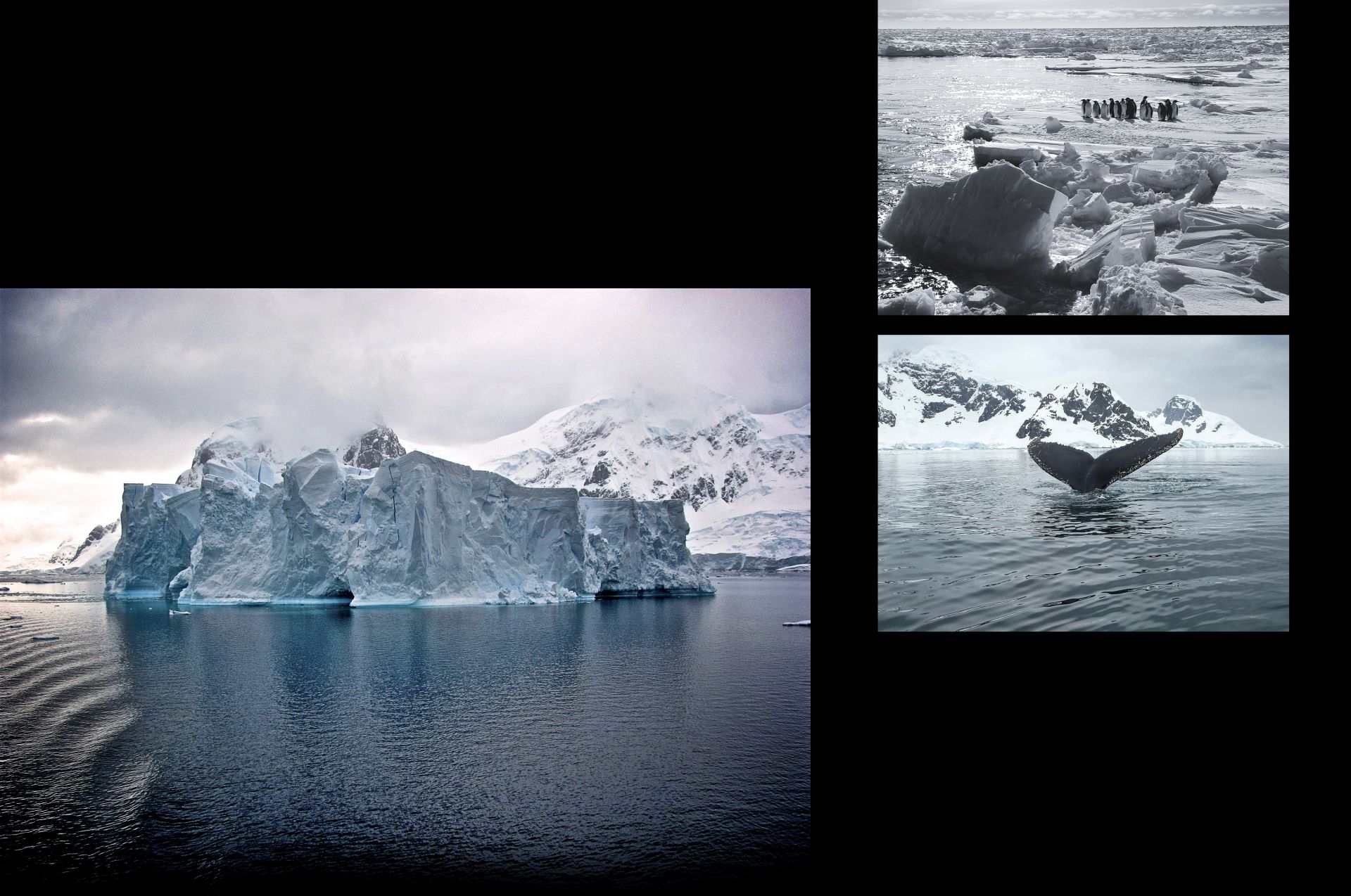
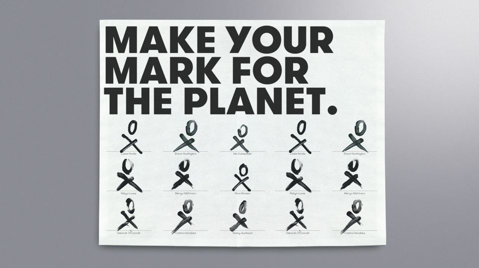
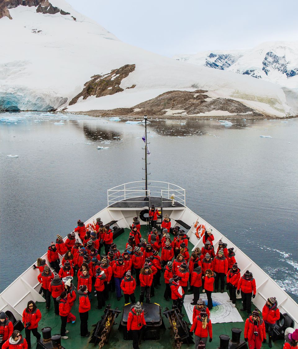
We crafted a logo. Reimagining traditional symbols for male and female. And invited women on the Homeward Bound expedition to Antarctica to finger-paint it. To add a personal touch to their pledge. To visualise their individual impact on the planet.


feels like
media impressions
media coverage for
women in science.
Asia Pacific Awards Grand Prix
Design Week Winner
Half the people I’ve shown this to were in tears. We all recognised, spine-tinglingly so, that the work captured the symbol for a global movement.
Fabian Dattner
Founder, Homeward Bound