
Go coconuts for
’beautiful brand
refresh


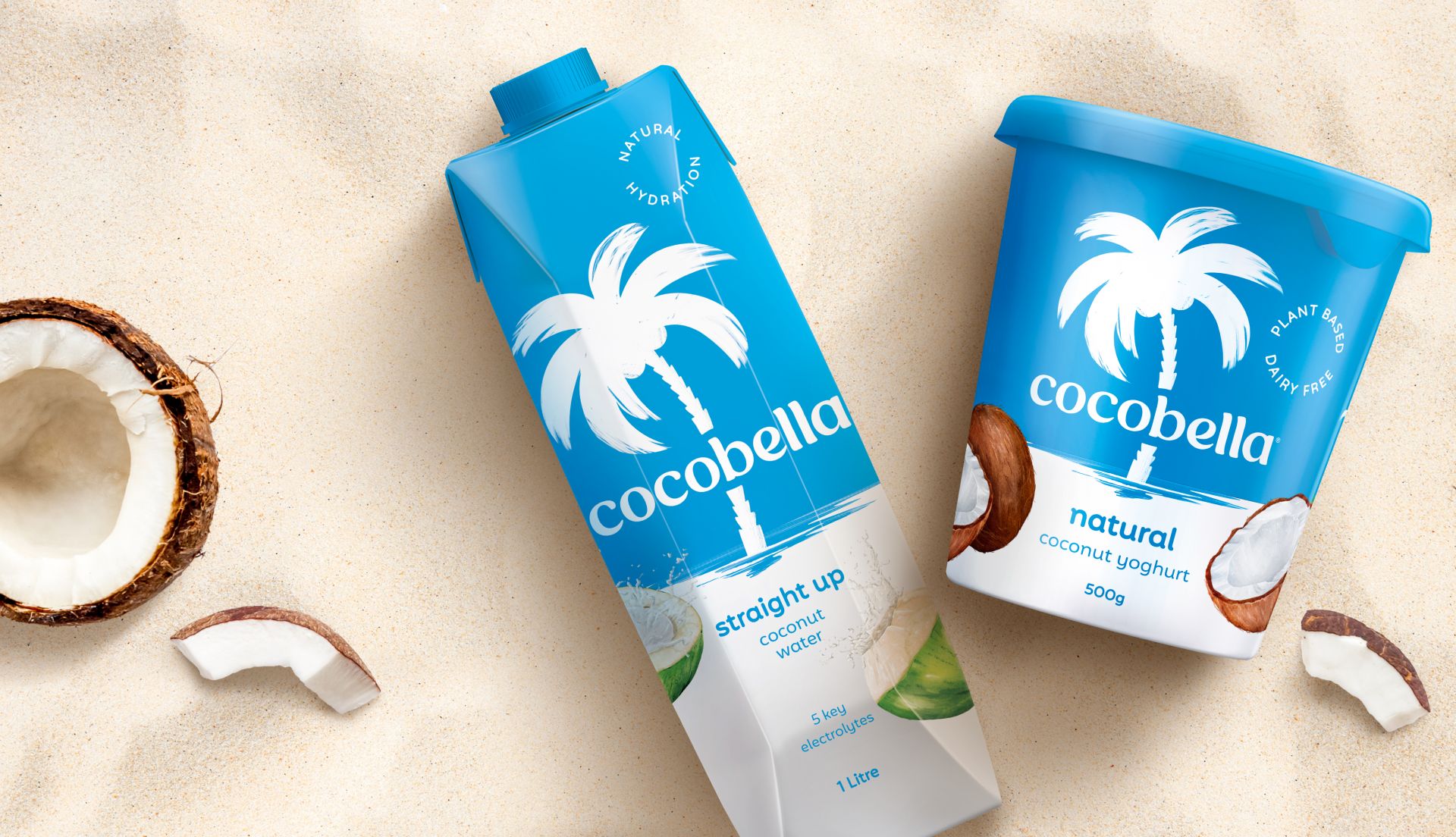
Everyone knows Cocobella. Yet despite being Australia’s favourite coconut water and yoghurt, the brand was getting lost on an ever-crowded shelf. Our task was to elevate the brand – to create a more impactful shelf presence.


Cocobella had a strong name and a faithful following, but market analysis revealed that it was competing for its spot due to an increase in direct competitors.
We saw a golden opportunity to both capitalise on the brand’s reputation and create a more iconic, fresh and timeless brand.
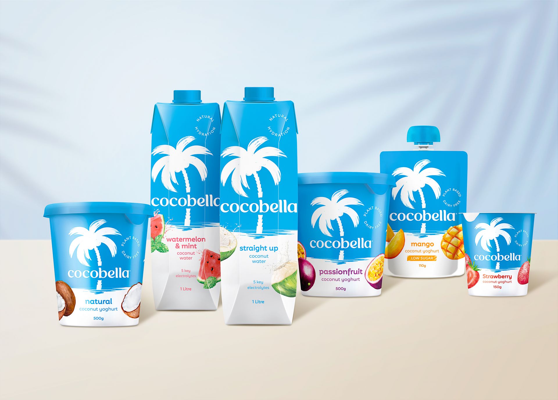
We crafted a brand story anchored in paradise - an opportunity to escape the everyday, transported to your own wonderland. This allowed us to create a suite of enticing assets - including a refreshed brand mark - that offered consistency, cut-through and longevity.
The Cocobella palm tree was the brand’s most recognisable and ownable asset, as was the Cocobella blue. Through strategic thinking, we refined their icon and applied it across all touchpoints, ensuring not only cohesion but creating a more visible and instantly recognisable element.
We reversed the brand colours to hero the Cocobella blue – a bold but considered move – to stand out in a sea of competitors with mostly neutral palettes, and to further communicate purity, freshness, and the idea of the picturesque paradise.


Taste was another aspect that we needed to enhance; something which Cocobella was renowned for. Through custom, detailed illustrations of fruit, we achieved the balance between luscious freshness and a point of artistic difference on pack.


feels like
the thrillsTM successfully reimagined the cocobella brand identity to create the ultimate standout. A much loved brand, the approach built upon existing assets to create something far more memorable and distinctive that transports you to paradise!
Luke Marget
Co-founder and Director Made Group